Storygraph Reading Journal Redesign
March - May 2024
(12 Weeks)
Timeline
UX Researcher
Product Designer
Role
Team
Me
A Personal Project
Project Type
✅ Conducting qualitative interviews and concept tests
✅ Identifying a critical user need via user research
✅ Working within an existing design system including typography, color, component styles
✅ Gathering user feedback to improve concept and design iterations
Skills
About Storygraph
Storygraph is a book-tracking app that burst onto the reading scene in late 2019. The app logs your reads, provides whimsical statistics about your reading trends, and helps you find your next page-turner.
About This Project
This project was inspired by a recurring New Year's Resolution to read more. Originally, I envisioned a community reading feed feature where users could engage with their friend’s reading activity in hopes of motivating users to read more. However, through in-depth user research, I redesigned an existing feature, Reading Journal, to better address user needs and potential business objectives. As a current Storygraph user and consistent margin-writer myself, I was excited to envision a redesigned Reading Journal.
Users waste time tracking book notes across several applications
The Problem
While conducting user interviews about users’ book reading and tracking habits, I discovered a pattern that users are forced to track books they’ve read across multiple applications because each application offers its own benefit. For example, a participant in a user interview mentioned she uses GoodReads to write public reviews and a notion database to write personal reflections about books.
“I rate books on StoryGraph, but I don’t like writing public reviews so I don’t do that. Instead, I have a place where I write my thoughts about books I’ve read that isn’t shared. I don’t do a full review. It’s usually a short paragraph about what I liked and/or didn’t like, kind of like a tiny book report for myself. ” - Storygraph user
☹️ Storygraph has a clunky Reading Journal feature
Current State
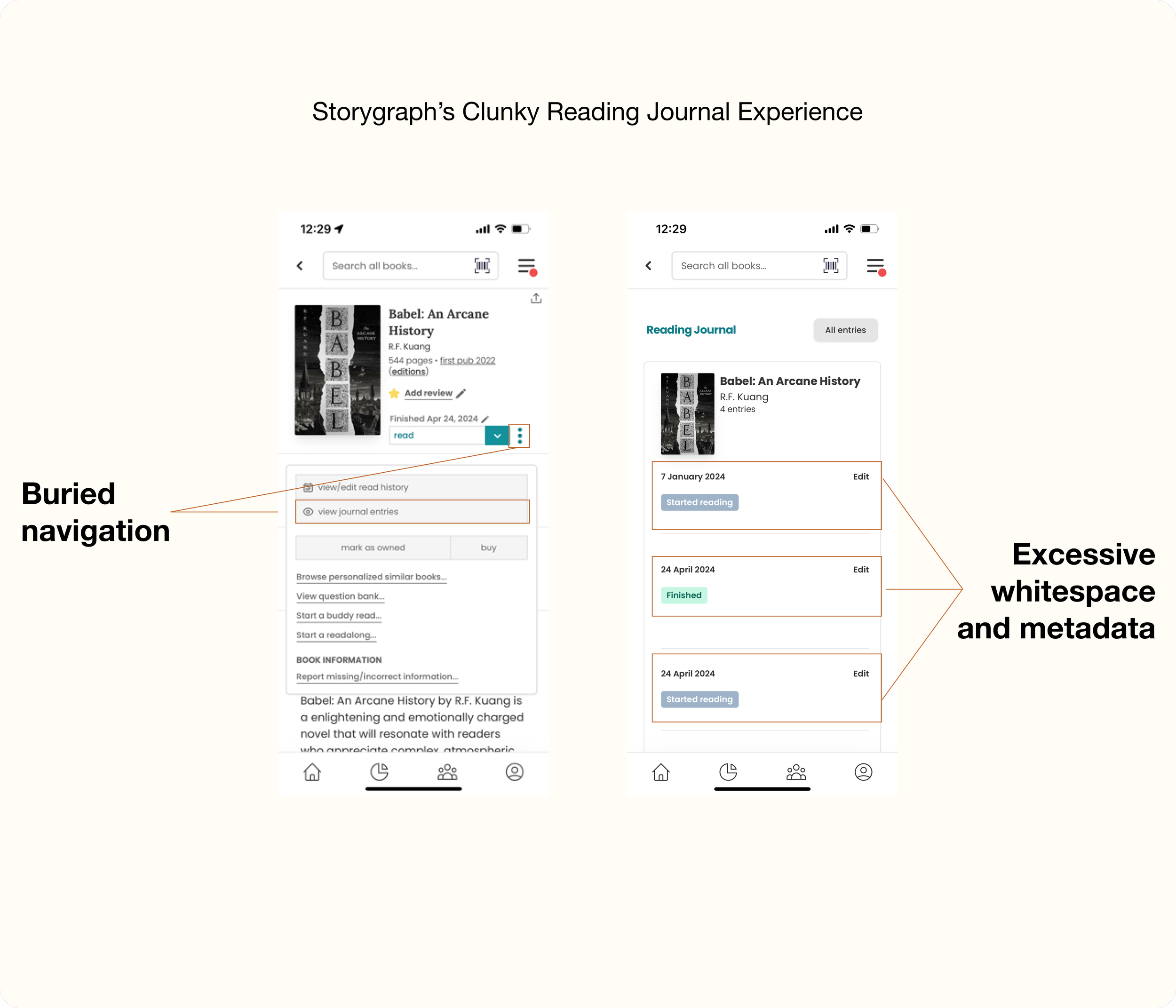
Storygraph has a private notes app feature titled “Reading Journal” which is difficult to find and unaesthetic to use. This creates unnecessary cognitive load and disincentivizes feature use.
On the mobile app, users must navigate under the 3 dots icon to find a “view journal entries” button in order to access the Reading Journal.
After clicking “View journal entries”, users must scroll through large entries with excessive whitespace to edit and add Reading Journal entries.
Key Research Finding
I concluded that the current Storygraph mobile experience lacks an efficient and easy-to-use Reading Journal interface, leading users to log their private notes about books across multiple applications and an overall fragmented book tracking experience.
An intuitive Reading Journal can save users time in their book note-taking experience
Value Proposition
For Users
A digital reading journal allows a user to not only quickly view all of their private notes at-a-glance but also search the digital record in an efficient manner.
For Storygraph
An easy-to-use Reading Journal would streamline the user note-taking experience and could be a revenue-generating premium feature in Storygraph’s paid plan, increasing overall platform adoption.
🤔 How Might We
How might Storygraph solve for fragmented book tracking across several applications to centralize note-tracking and save users time?
😊 My Hypothesis
By clearly improving the navigation and UI of the Reading Journal, users will feel more incentivized to log private notes on the Storygraph platform, increasing conversions to Storygraph as their sole, centralized book tracking application.
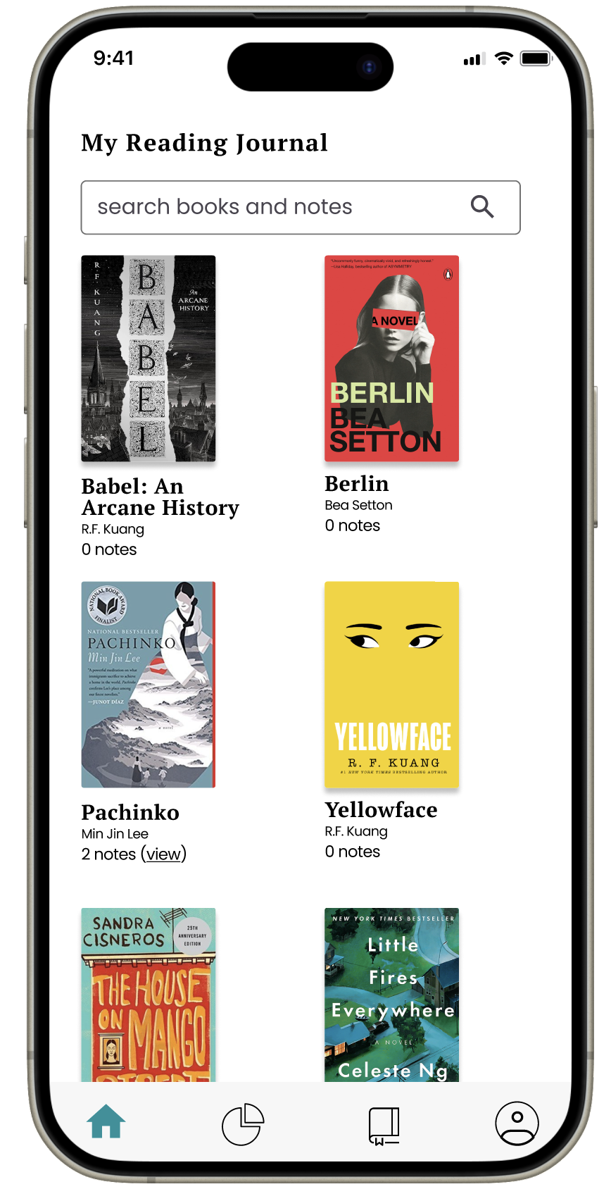
Meet the new and improved Reading Journal. Easily return to your favorite sections, quotes, and ideas, in the same place where you track your reads.
The Solution
Simpler Navigation, Improved UI, and Search Functionality
What’s New
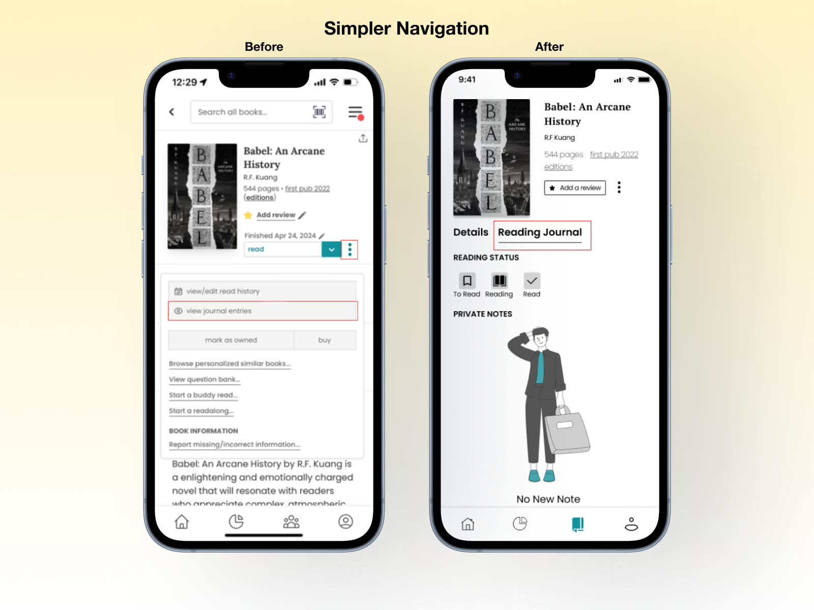
🥳 Simpler navigation - The reading journal is presented as a core tab in the book details page. Additionally, the reading journal tab is a core button on the navigation bar for increased discoverability.
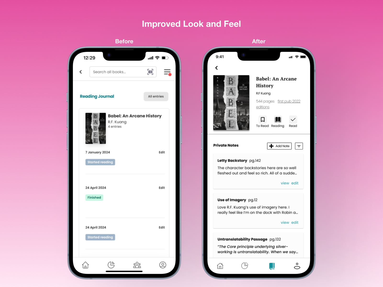
🥳 Improved Look and Feel - Within the redesigned Reading Journal, there is less white space and increased component consistency which results in less scrolling and more information visible at-a-glance.
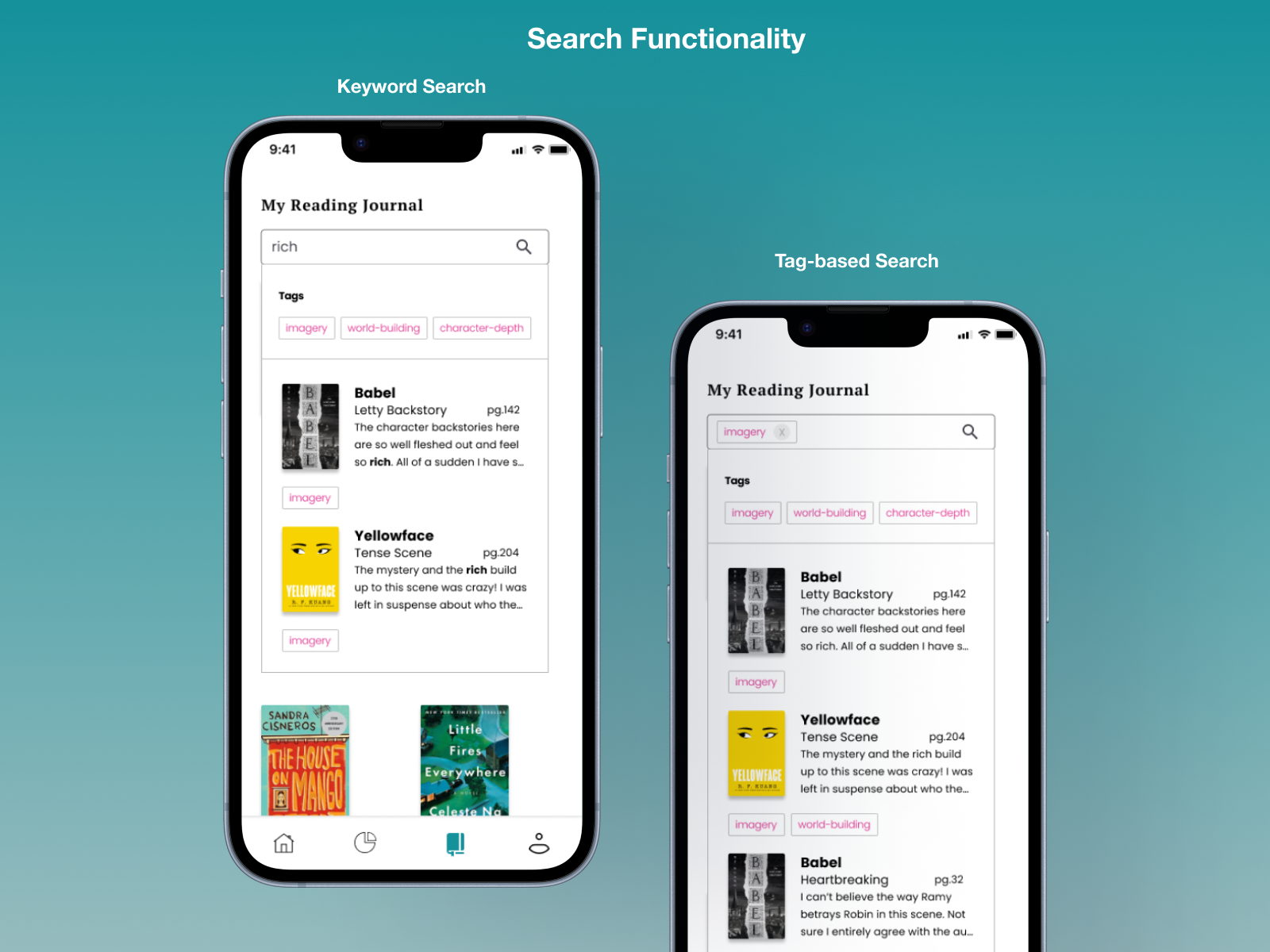
🥳 Search functionality - The ability to search across all reading journal entries with tags and relevant text allows users to make the most of their digital journal by referencing themes across books.
Desktop Considerations
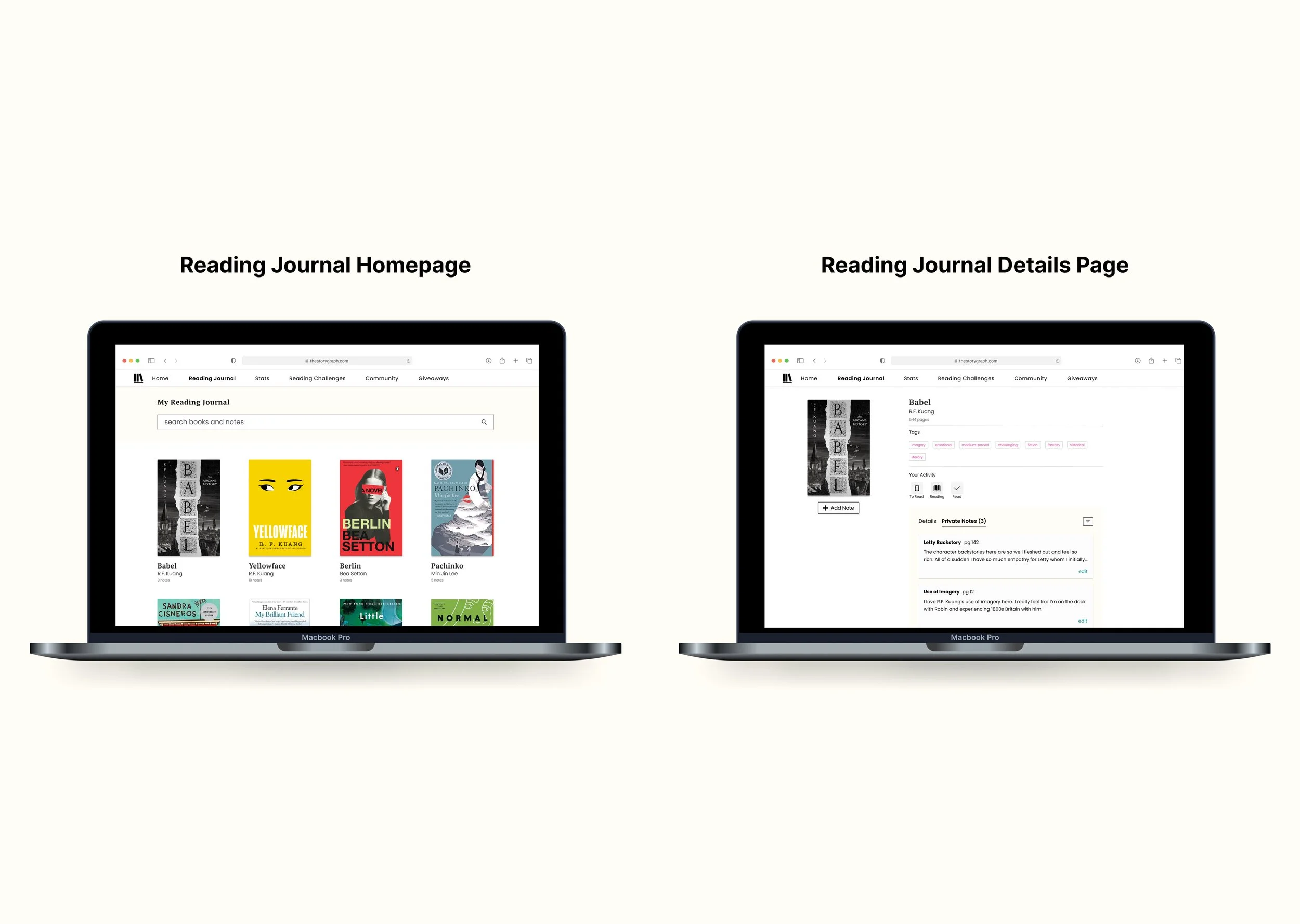
From user research, many users detailed using their laptop to enter notes entries for books. Therefore, I designed for the desktop use case. Several adjustments included increasing the font size to accommodate a further reading distance and designing for higher information density.
Low fidelity Sketching
A compilation of some sketches including storyboards, crazy 8s, component iterations, and user journey mapping. Iterating Designs based on User Testing
Reading Journal Homepage
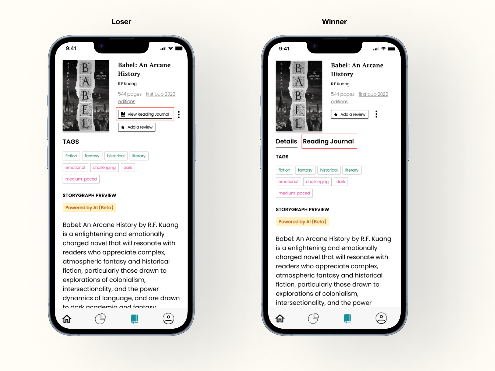
During concept testing, I A/B tested a button versus a tab navigation for the Reading Journal. Users preferred the tab navigation, citing the button looked too visually cluttered and boxy at the top of the page. I also hypothesized that a tab placement would improve the discoverability of the feature.
👎 Loser: The “View Reading Journal” Button added to the visual clutter of the top section and made the page feel excessively boxy.
👍 Winner: The Reading Journal tab reduced visual clutter and users could intuitively navigated to it.
Future Considerations
🎨 Design
Design an import notes function that transfer notes from existing databases such as Notion into the new Reading Journal to seamlessly integrate user data and increase feature conversion.
💰 Business
Send a survey to validate the desirability of an improved Reading Journal function with existing users. Some questions could include: Do you use the Reading Journal function in Storygraph? How often do you write personal book reviews? How many platforms do you currently track your reads on?
Measure discoverability and usability by measuring:
Clicks on the Reading Journal before and after the redesign to reflect the discoverability of the feature.
Journal entries created by the user before and after the redesign to reflect how usable the Reading Journal feature is.
The Takeaways
What did I learn?
1. Design for the user
During concept testing, I heard users mention fragmented note-tracking. The insight was independent of any one of the concepts I was testing and led me to pivot the design solution to address the specific user need.
2. Thoughts flow faster in a sketchbook
Sketching and iteration happened much quicker in a sketchbook than in Figma. Sketching allowed me to iterate on design concepts quicker and I made great use out of my Moleskin.
3. Learn the design system
This was my first time capturing another system’s border radii, typography, colors, component cards, etc. I learned to pay careful attention to Storygraph’s existing design system and design within its constraints.

